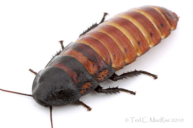
I don’t pretend to be a photography guru – I’m learning, and though I still have much to learn I’m happy with my progress so far. The photographs I posted earlier this week of Gromphadorina portentosa, the Madagascan hissing cockroach, were the results of my first attempt at photographing insects in a white box, and I was reasonably happy with the results. However, a commentor suggested the photographs could benefit from increased contrast – and he was right! I admit that I haven’t focused much on post-processing so far, as I’m still in a rather steep part of the whole insect macrophotography learning curve thing. I have played around with the different enhancement tools in Photoshop Elements, but for some reason I don’t find them all that intuitive, and just playing around with them hasn’t helped me understand how they work or the best way to use them. The Photoshop online help site wasn’t much help either – in fact, it was all gibberish to me! I started to wonder if maybe I just lacked some basic talent when it came to understanding post-processing.
Fortunately, the commentor provided a link to an excellent article at EarthBound Light called The 1-2-3 of Photoshop Levels. That article opened up for me a whole new world of understanding! It explained that Levels is a better alternative for optimizing photos that Brightness and Contrast, and it did it in plain English! I actually understood it! Well, my appetite whetted, I started browsing other articles at the site and found the object of my desire: a clear explanation of the seemingly misnomored “Unsharp Mask” in an article called Behind the Unsharp Mask: The Secret World of Sharpening. I read it excitedly, just waiting for it to become unintelligibly technical, but it was as clearly written as the previous, and for the first time ever I actually felt like I understood the basics of how to use Unsharp Mask. Well, I couldn’t wait to take my newfound knowledge and apply it to my photos of the already spectacular Gromphadorina portentosa to see if I could make them really pop. The following comparison shows the original photo of the male (size reduced to 1200×800) and the optimized photo adjusted for levels, color, and sharpness (also slightly cropped). What do you think?
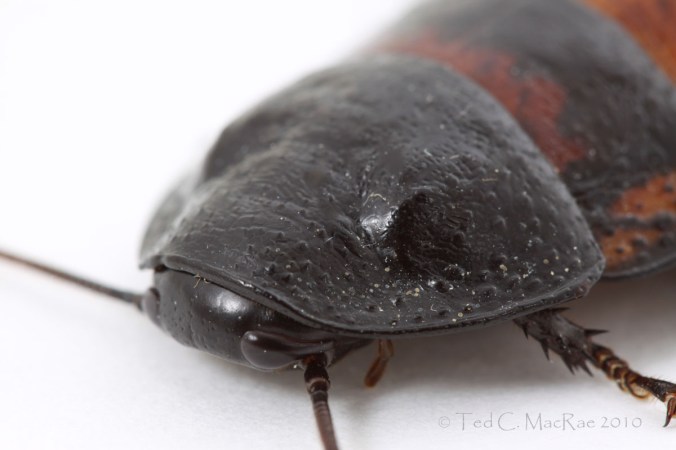
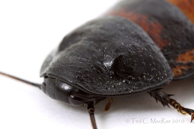
Here are paired comparisons of the other photos I included in the original post with their optimized versions (click to see enlarged versions). I would be most interested in hearing any specific comments you might have about these optimizations.
Copyright © Ted C. MacRae 2010


These are great pics, Ted, as I mentioned last time. So.. once again these comments are hopefully just small constructive criticisms of photo’s which are already up there with (or better than) what I can produce.
Firstly as you’re probably aware, everyone’s screen, screen settings and colour profiles are different, so what is over saturated on one screen can look perfect the next. Something which should always be at the back of one’s mind when looking at pics on the net. There is a dark art called colour management, which adjusts your display to match that of your printer, or another display (for example), or a set standard. Not really worth getting into unless you’re a pro though, in my opinion.
In general I feel your post processed images are definitely an improvement, but (isn’t there always a but?!)… they do highlight a problem with the levels tool, and the difference between good illustration of features and aesthetics. For example, aesthetically I prefer the more contrasty (“punchy”) images, but some have lost a little detail in the darkened areas. This is especially evident on pair 3 of 5, with the top of the head (on my screen…) losing detail.
So… the problem with the levels tool is that it creates an image-wide adjustment. This is often fine with a landscape which has a nice bell shaped curve in the photoshop histogram, but can lead to issues with high contrast situations such as here. The solution requires a touch more work, but is well worth it with nice images such as these. Take image pair 4 of 5 for example. The nice white (instead of grey) background and the punchier body are a definite improvement, but the head is a little dark and too contrasty. They solution is to use a selection tool (such as the pen) to create a selection of the head/thorax, pop it on another layer and give it the levels treatment separately. If you get a hard line around your selection, you can simply feather it slightly before you put it on the new layer. This won’t always work, but it can help with difficult subjects.
One more tip seeing as you are just getting into post processing… one I learned the hard way. Always work on a copy of your photo, and save the original untouched elsewhere. Once you’ve saved these changes, there’s no going back!
These pics really bring home how close their face is to the ground! Reckon I’d get claustrophobic!
I agree with peteryeeles about images #3, but overall, very pleasing tweeking. Think you might ever want to teach some local entomophiles about this in, say, a WGNSS workshop?
Funny, once I got into work and looked at them on a different monitor, I don’t agree with my comment about #3 any more. Kinda like Alex’s experience, below.
Looks great Ted! I agree with Peter about some of the drawbacks to the curve, but with some more practice you’ll be right at home with it! Looking forward to seeing how this summer’s photos turn out!
This isn’t the concern of your post, but I’m a little overwhelmed by the shallow depth of field.
Your first photos look better on my computer at home, but your new set look better on the lab computer. This is to say, it’s really hard to do a global optimization of these things.
So much depends on how the light and color information are transmitted through the medium. I often make up one set for printing, which is contrasted and color-balanced somewhat differently, and a different set for the web. But it’s good to be aware of the issues and how to fix them for different purposes.
I don’t know what Bill is saying about the shallow depth of field. For my tastes you’ve nailed it perfectly- slight blurring of the back bits gives a sense of perspective and immediacy to the image.
Thanks for the link Ted. ‘Ctrl L’ is usually the first command I use in Photoshop, but I never had any understanding of what I was really doing (and no idea about the ‘Alt’ trick).
Can’t agree too much with Peter’s advice about always working on a copy – and when you think you have one effect right, make another copy before trying something else.
I don’t want to overwhelm you with info, but sign up for Tim Grey’s DDQ emails. Tim has a good understanding of things.
http://www.timgrey.com/
Keep up the good work!
I think the new versions look great, Ted. Though it’s true you’ll never get beyond display differences, your leet skillz are shining through from where I’m sittin’. I can’t wait to see where you go from here.
Definitely looks better, especially on my lap top monitor.
I use Adobe Camera Raw (ACR) to process my raw images and I often add quite a bit of Fill to show more details in the dark/black area.
Wow, lot’s of great feedback – almost overwhelming. I really do appreciate all your constructive comments. There were a number of different issues covered, so rather than try to respond to each one individually let me just summarize my impressions from the conversation.
Two important things: 1) different monitors will give different results, and 2) different people sometimes see things differently. I’ve already experienced the monitor thing – I do most of my photo work on the laptap screen during off-hours but dock it with a full-sized monitor while at work. Things never looked as good on my older monitor, but when I upgraded to a nice, big flat-screen everything looked a lot better. I would prefer to use the flat-screen for photo work, but then that would mean I’m working on my blog at work, and something tells me that wouldn’t last for long 😛 Or I could go into the office during off hours rather than sit here in my nice comfortable recliner whenever I wanted to do photo work – hmm, tough choice. At any rate, my screen is my screen, so I can only do what looks good to me.
Depth of field could be better on photo 3 definitely and maybe 2 and 5, but I like where it is for the full body shots for the reasons Alex states. Like I said, this was my first experiment with a white box, and I’m also not quite used to working with insects this big and with so much distance from the lens to the subject – I guessed f/10-11 would be fine but f/13-14 might have been better. The real issue with Photos 1 and 4 isn’t DOF but focus. I didn’t quite nail the head on either one, but rather hit it just behind the head on the side of the pronotum and first few abdominal segments. That’ll come with practice.
Yep – I do everything with a copy and save multiple versions so I don’t have to start over if I find I don’t like something I’ve done along the line. The original stays untouched on an external hard drive.
Loss of detail in the dark areas seems to be the biggest thing for me to look into – monitor differences notwithstanding – but it was also the thing that was least clear to me what I actually need to do. I don’t understand the statements “pop it on another layer…” or “feather it slightly…” or “add quite a bit of Fill…” Also, while I have been shooting both RAW and JPG from the beginning, I still haven’t learned how to work with RAW files. Guess I better start trying to figure that out, too.
Photoshop (and elements) have a system where you can layer bits of the image upon one another (have a look at this). It’s the same as z-stacks if you’ve used any of the microscopy imaging software. So, you can select a bit of your image and put that on a new layer, on top of the main layer. Everything on the new layer except the bit you pasted on it, is transparent. This means that any adjustments (levels) you make to the new layer only affects the bit you pasted onto this new layer.
As for feathering; when you make a selection, the edge is a hard boundary. Unless you’re very accurate with your selection, this boundary will often show up if you make any changes to what you adjusted (it can look like a halo, or a flaw in the image). Feathering softens this boundary. I’m actually struggling to describe this! It’s one of those things which is better illustrated with an image… so here’s another link!
Hope this helps. I’d also say that with Photoshop there are often 10 ways of doing the same thing. I’m sure some of your more photographically minded readers will have more efficient ways of completing these manipulations.
I ‘m enjoying the posting and comments immensely. As someone who is new to both photography and blogging, I’m amazed by the wealth of information that is available through a number of the blogs highlighted in your Blogroll and the myriad of ways in which it is presented.
You did a great job of presenting your experiences and images concisely and meaningfully. The side-by-sides are excellent. I look forward to more of your technical adventures!
How about making your next adventure something related to depth of field?
Hi Ted, you’ve got lots of tips from plenty of practiced photographers. While I haven’t attempted macro photography, I doubt there is much difference once you are post-processing. I am a big believer in capturing photos in RAW. At first, I didn’t know how to work with RAW, but it turns out that it is a breeze with the right software. Personally, I think Photoshop (full version – not Elements) is worth the price. That said, I have never use it to create layers of selected level-adjusted areas to produce a final photograph. I simply don’t have the time nor inclination to work that hard on attaining a perfect photograph.
If you shoot in RAW and use Photoshop, you can get the most out of your photos, with only a little work. You can even adjust the exposure if needed. If you want that perfect image, you can certainly get closer with RAW and Photoshop.
Photoshop is also a great tool for creating artsy-type images, as I sometimes do for logos, badges, and other creative projects. You may remember (way back), my first hosting gig – CotS. I featured a photo of a bug divided into clickable squares, each taking you to a different post. That was the nifty Slices feature in Photoshop.
I have tried Gimp and Gimpshop – which attempts to mimic Photoshop in opensource code. It was just too different, and I didn’t want to spend the time on another learning curve. Too much to see and do outside!
Best of luck to you on your photography. I sure enjoy it!
Great post and comments… think I need to take a photoshop class! Thanks for sharing your examples.